
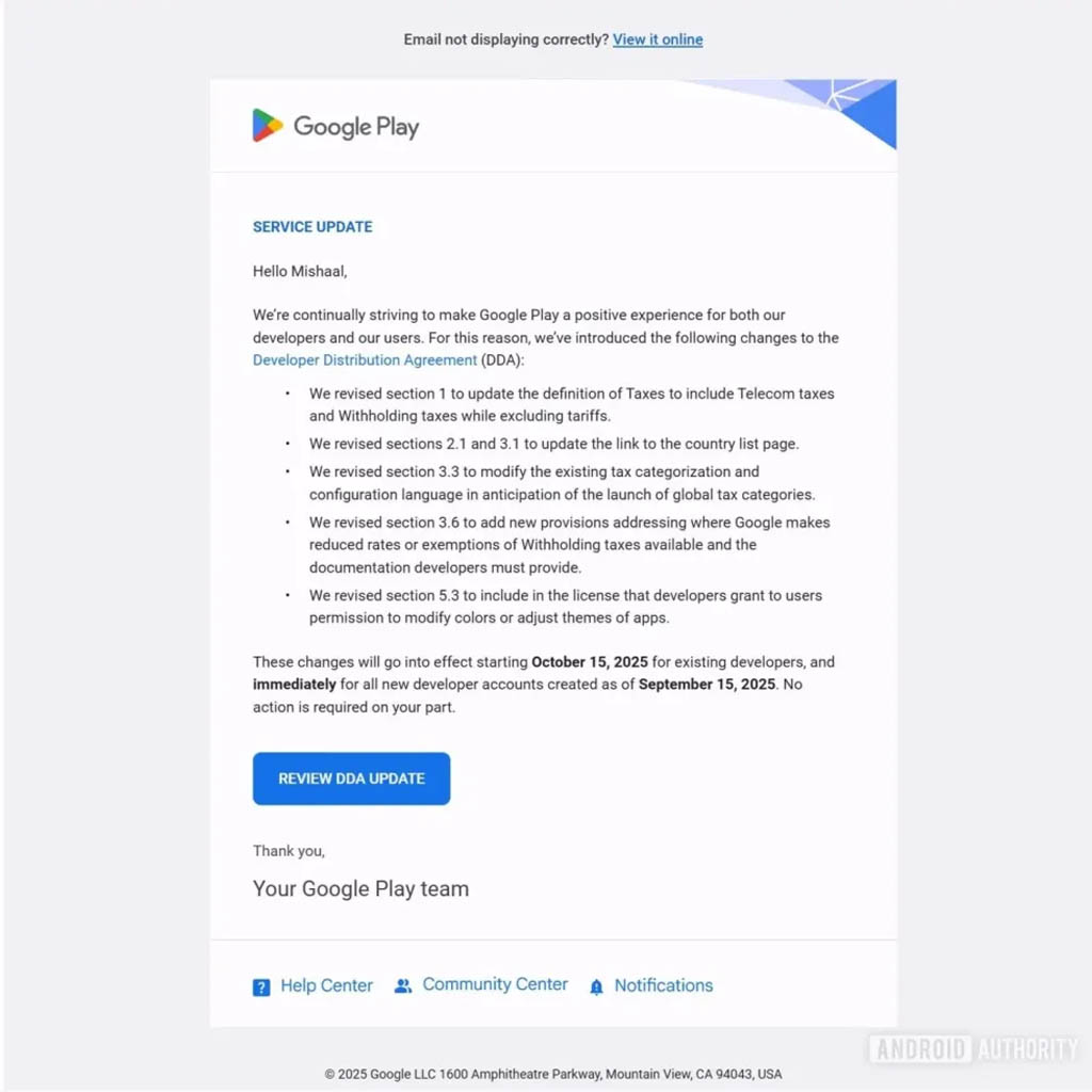
Exciting news for Android users! The upcoming Android 16 update is set to shake things up by mandating that all apps automatically adjust their themed app icons. This change aims to create a more cohesive and visually appealing experience across the Android ecosystem.
What’s Changing?
With Android 16, developers won’t have a choice—they’ll need to ensure their app icons align with the user’s chosen theme. Whether you prefer a dark, light, or custom color scheme, your app icons will seamlessly blend in, providing a more unified look on your device.
Why This Matters
This update isn’t just about aesthetics. It’s all about enhancing user experience. A consistent appearance across apps can make navigating your device more enjoyable and intuitive. Plus, it ensures that your home screen looks sharp and stylish, no matter what apps you have installed.
What Developers Need to Do
Developers will need to update their apps to comply with this new requirement. It might take some time, but once they adapt, users can expect a smoother and more visually pleasing interface.
The Future of Android
As Android continues to evolve, these kinds of updates show a commitment to improving user experience. With Android 16 on the horizon, users can look forward to a more harmonious and attractive app landscape.
Stay tuned for more updates as we get closer to the official release of Android 16!